Honouring our community, history and natural surroundings
The City of Burnaby has an official coat of arms, seal, flag, badge, flower and logo. The symbols all honour our community, history and natural surroundings–our trees and plants, waterways, wildlife and mountains.
Coat of Arms
Burnaby's coat of arms was developed as part of our City's 100th birthday celebrations in 1992. It represents the bond between Burnaby's natural surroundings and our community's history.
Learn the meaning of each part of Burnaby's coat of arms:
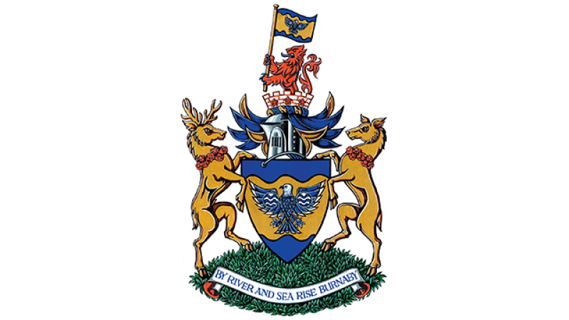
The shield of arms is located at the centre of the coat of arms. It represents Burnaby's location in the heart of the Lower Mainland.
- The blue of the Inlet to the north and the Fraser to the south is separated by the gold of the land, representing both the riches of nature and those created by human effort.
- The eagle, symbolizing the spirit of the whole community, is at the centre of the design–it also refers to Burnaby Mountain–home to beautiful surroundings and wildlife.
- The wings of the eagle are decorated with water symbols–one each for Deer Lake and Burnaby Lake.
The crest is found above the shield. It blends symbols that honour Burnaby's past with others representing civic government.
- The red and white colours represent Canada. They're also featured in the 16th century coat of arms of the ancestors of the man for whom our city is named, Robert Burnaby.
- The crown of silver stones is the ancient symbol for municipal corporations. It's decorated with strawberry flowers (fraises)–a nod to the strawberry farms once found across Burnaby that are now the market gardens by the Fraser River. These fraises are also featured in the arms of the Fraser Clan–Simon Fraser discovered this major BC river that's named after him.
- The lion at the top of the crown comes directly from Robert Burnaby's family arms. It honours all the pioneers who settled this area. The lion also represents the spirit of the district government, headed by the mayor and council. The lion is holding our district flag.
The motto, "By River and Sea Rise Burnaby", was found on the first District Seal in 1892, the year of incorporation. It links our present with our past.
The supporters are two deer, male and female, located on either side of the crest. They represent the natural heritage of the district and the men and women who have helped create and preserve Burnaby–their collars of red rhododendrons (Burnaby's official flower) were a specific reference to their support of Burnaby.
Official Seal
The use of seals–either in wax or embossed on paper–to authenticate records and laws, is a practice as old as writing itself. Seals of this nature were applied directly to the face of the document and helped maintain a document's authenticity by certifying the identity of the creator and the originality of the record.
Burnaby was incorporated under British Columbia's Municipal Act which specified that the executive powers of every municipality were to be exercised by the elected reeve and councillors. Further, it stated that "Each Municipal Council shall have a corporate seal and the municipality shall enter into all contracts under the same seal, which shall be fixed on all contracts by virtue of an order of the Council." Shortly after incorporation of the municipality in 1892 it's assumed that Burnaby Council ordered the creation of its seal as it appeared on bylaw documents and debentures as early as 1892.
This first seal featured a rural scene that was a common sight in pioneer Burnaby - a farmer and his horse ploughing his fields with a small cabin in view overshadowed by the tall trees of the forest. In the background a sailing ship on the Pacific Ocean is centered within the setting sun. Above the scene a motto banner is decorated with a beaver and maple leaves–the symbols of Canada. Written in Latin, this first Municipal motto was "Concilio et Labore", which roughly translates to: "United through Work".
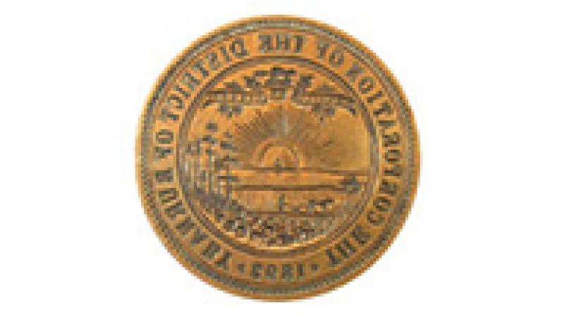
A mystery surrounds the disappearance of this original seal. The seal was in use until 1898 when the Great Fire of New Westminster (September 10-11, 1898) destroyed and damaged Burnaby's municipal papers which were being housed in the offices of Clerk Alexander Philip. It appears that council may have assumed that the original seal was lost in this fire and ordered a replacement in 1899.
In fact the seal had actually been broken off its original press prior to the fire and had been sent out for repair to local machinist Edward William Brooks. Whether council decided to abandon its attempt to repair the seal or had forgotten about its location is not known.
The brass seal mould did survive and was passed from Edward W. Brooks to his son George Brooks, who in turn passed it on to his daughter Barbara. In July 1995 Barbara Nicholls, through the aegis of the Burnaby Historical Society, presented the seal to Burnaby City Council and in 2002 this important artifact was deposited into the collection of Burnaby Village Museum.
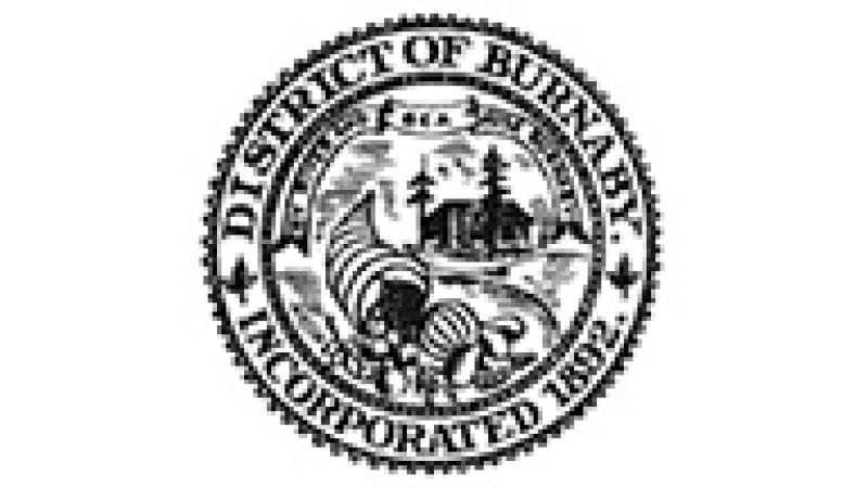
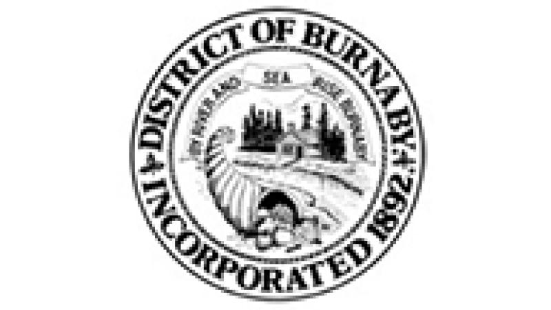
On January 21, 1899 the reeve was requested and authorized by the council to "have a suitable seal made for the use of this Corporation". This new seal was considerably different from the original seal. A banner contained the new motto 'By River and Sea Rise Burnaby'. It featured a small cabin beside a forest and stream. In the foreground was a Horn of Plenty or cornucopia filled with fruit and vegetables reflecting Burnaby's agricultural production. This seal was reproduced graphically by City staff and used for many years on official letterhead and other documents.
In 1930 the original crude drawing of the seal was revised by Norman Hawkins F.R.G.S. of the municipality's engineering department and used for many years. It was redrawn again in the 1970s–unfortunately, the municipality's graphic designer mistook Hawkins image of a large ribbed melon for bananas, making the new seal design more tropical than intended.
In 1992 when Burnaby became incorporated as a City a new seal was adopted using the coat of arms presented to the City in 1991.
It's still used today and it's impressed into the City's original bylaw documents, proclamations and other documents.
Flag
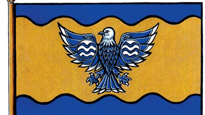
In proper heraldic fashion, the flag is composed of the elements on the coat of arms shield reshaped to serve as a banner.
A Burnaby flag is now flown outside Burnaby City Hall.
Badge
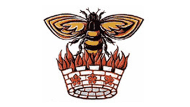
When heraldry (identifying symbols) was first invented about 800 years ago, a popular approach involved using symbols which were a pun on the name of the corporation or individual.
Our badge is a current example of that approach for "burn-a-bee" that has been drawn for use as the civic badge. Here the Burnaby civic 'crown' has been taken from the crest and blended with flames and a bee.
Burnaby's Official Flower
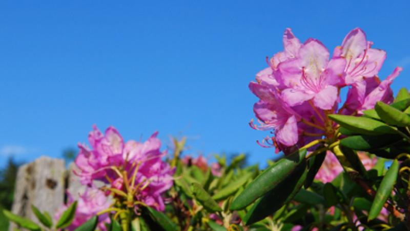
The rhododendron was officially adopted by council on August 22, 1966. Century Gardens was established as the municipality's 1967 Centennial Project at Deer Lake Park. It became a rhododendron display garden that remains as one of the best of its kind in the province.
How the 'rhodo' came to be our official flower:
The rhododendron was selected as Burnaby's official flower in 1966 as part of Burnaby's preparations for marking Canada's Centennial Year in 1967. The Parks and Recreation Commission decided that the Centennial should be celebrated with a horticultural theme, so hundreds of roses, azaleas and rhododendrons were planted throughout the municipality. In the process, the commission considered the idea of Burnaby adopting an official flower as part of the celebration. The commission considered the yellow iris and the rose but rejected them for their short flowering span and the difficulty of growing and maintaining them.
The commission finally selected the rhododendron because rhodos would be the most spectacular for the least expense and maintenance. In a 1966 interview with the Courier-Examiner, Councillor Doreen Lawson said, "The plants are ideally suited to our coast climate...and can be relied upon to put forth flowers in great abundance each spring, creating a show which would draw tourists while it beautified Burnaby".
In 1992 as part of Burnaby's Centennial, a new hybrid rhododendron was propagated and named "Burnaby Centennial".
Burnaby's Logo
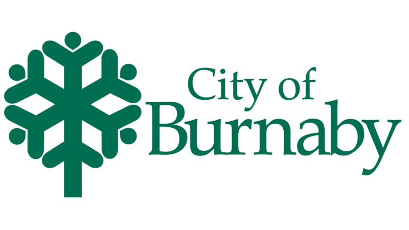
The Corporation of the District of Burnaby adopted the use of a new logo that was approved by Council in 1976 as part of an overall "Visual Identity Program". Its 'pop-art' style reflects the graphic design trend of the day, as does the use of a logo for identifying a corporate place of business.
What Burnaby's logo represents:
The meaning of the new logo was explained in a 1976 description.
The main design is within a circle, representing a well-planned and solid community. The geometric shape is divided into radial spokes like a bike wheel. The branches off each spoke suggest people holding hands. All in all, it represents an active and involved community held together by a strong centre. The final element is environmental. The overall shape looks like a tree and it's colour is green.
In 1992, when Burnaby was incorporated as a City on its centennial, the logo was redesigned with a new colour and font.